At 16, Rob Saunders discovered calligraphy. At 17, after being grilled by the curator, he was granted a reader's card at Chicago’s Newberry Library despite his youth. There, he began to study rare books and manuscripts hands-on. This would lead to decades of collecting, and to Saunders’s work as a letterform artist, educator, publisher, and curator. The extraordinary quality of his collection began to come clear in 2012 when the San Francisco Public Library sent him a young couple fresh out of The Hague’s Royal Academy of Art. They were looking for Der Wassermann, a rare book that SFPL’s Special Collections did not have. Among 15,000 other treasures, Saunders did.
Around this collection and the couple, informal gatherings began to attract young creatives and digital natives with a “thirst” for access to the analog and the original. Bypassing the institutional wall distancing non-academics from rare books, in 2015 Saunders opened the Letterform Archive, having found the name on GoDaddy while sitting in the audience at a TYPO conference.
Letterform made 40 years of collecting— lettering, typography, calligraphy, and graphic design— available to anyone anywhere in the world with a screen and a connection. In under two years, it had tripled with the addition of collections from Dutch publisher Jan Tholenaar, digital design magazine Emigré, and Speedball pen inventor, Ross F. George. Donors quickly came to trust that Saunders would make the work widely accessible in ways that larger institutions might not.
In fact, the floor-to-ceiling Ikea shelves and flip bins that filled his Potrero Hill loft had pushed Saunders out of his own home before the archive was moved to its current location in an industrial building in Dogpatch. Today, Letterform preserves thousands of years of history in more than 100,000 artifacts, ranging from books to posters and ephemera, as well as a well-stocked reference library.
Bringing millennia of analog genius to a generation of digital natives, it welcomes guests in person but has also developed a powerful, high-resolution online presence. The extraordinary quality of its digital reproduction lies at the root of all Letterform does physically and virtually: teach, host researchers, curate exhibitions, and publish lush books. We spoke with Saunders about raking light, design hacks, why he doesn’t identify as a book collector, and the beauty of worming.
Being able to touch a thing gives you a connection you can't otherwise get. When it's historical, there's just some kind of magic.
William Stout Architectural Books: When you began in college, how did you focus your collecting?
Rob Saunders: I collected the way most design students collect, which is the texts that you have to have, books about your heroes, and books about movements or genres that interest you. But it was always a collection gathered by a designer for inspiration, so it was very idiosyncratic.
And I never thought of myself as a book collector. There's a real difference, because book collectors care about things like condition. And I just don't. The value of the archive just isn't all that great, in the aggregate. It's a funny thing to say. Add it all up, sell it, and you maybe get one nice painting. Things aren't here because they're precious.
WSAB: So you’re not concerned if there’s a certain amount of damage, like worming, as long as the letterforms are visible. You seem to value flaws and traces of the hand as much as teachability, legibility, and beauty.
RS: Yeah. It's interesting you mention worming, because there isn't a lot of it in the world, and it's a kind of minor flaw in some of our early printing. But it's also beautiful sometimes. I can think of one manuscript I bought because of the worming and the interaction between the worming and the calligraphy. Things that we don't compromise on at Letterform are completeness and, for example, the size of the margins. That is a crucial thing in an old book in order to understand the book design. And that is important for what we're trying to represent, which is the design of the objects.
WSAB: How did opening the archive change what you were collecting?
RS: We realized that our followers were all over the world. We wanted to develop a teaching collection, which meant bringing in stuff within the canon— we didn't have a good Book of Hours or a leaf of the Gutenberg Bible— but also becoming more representative in a variety of ways by expanding the canon across other continents, cultures, scripts.
WSAB: Which is the best way you’ve found to connect the collection to the public?
RS: I can't single out one program because it’s all driven by the same motivation, which is to build a delightful collection and share it broadly. Obviously, the online archive has been hugely popular. Our exhibitions have solid and growing attendance. Type West is collections-based instruction that sprouted an online cohort during the pandemic and then we just couldn't stop it. But probably the deepest reach is the books.
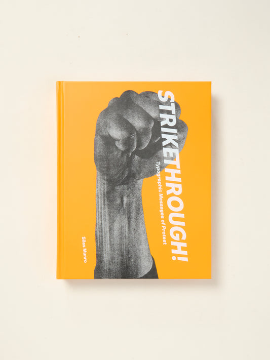
WSAB: Your books, like Only on Saturday, Jack Stauffacher’s wood-block prints and NKF, Piet Zwart's sales catalog for the Dutch cable manufacturer, are gorgeous. What’s the role of publishing at Letterform?
RS: Books have the advantage of being sold worldwide and bringing in revenue. We see it as marketing. Anybody that gets any of these books and doesn't know us is going to want to know more. And eventually they will, because the books are very much positioned as part of an organization, as opposed to just a publisher.
WSAB: One thing all your programs have in common is the extraordinary quality of visual capture of the artifacts, which really connects the archive to people who can't visit in person. The extreme detail, texture, depth, zoomability, and panning let people explore artifacts intimately.
RS: Publishers photograph the thing, and then basically they kind of square it up, trim the margins. When you shoot a book, there's a natural drape. If you're not showing that, you've actually cropped to a distorted image, and it's jarring. We take great pains to catch that in a very natural way.
WSAB: You have your own publishing team in-house now but, early on, you collaborated with E.M. Ginger at 42-line in Oakland to digitize artifacts to an extremely high standard.
RS: One of the key things that she innovated was raking light, which is directional light that captures surface texture. It’s tricky but it’s definitely the way to get the physicality of the thing. That was a significant differentiator, because if you look at our books, the repro quality is better than our peers, both graphic design publishers and other libraries and museums. It's very noticeable.
WSAB: William Stout was trained as an architect so it seems natural that he designed a ladder to access the shop’s bookshelves. But as creative director, you’ve also developed some modular furniture to store and display the collection.
RS: If you're looking for evidence that I'm a hacker, there's plenty of it. The first archive was my apartment with Ikea shelving engineered in a unique way. The rolling ladder was a converted Home Depot ladder.
The display in the meeting room is another example of how I hack. Its basis is the Dieter Rams shelving system for Vitsoe, which has been around forever. It's old, it's revered, it's beautiful, it's simple. So basically we put a galvanized steel sheet on the wall that’s hardly visible when painted, so now the wall's magnetic. Then we put up hanging strips of acrylic that just pop out and we asked Tap Plastics to make an L-profile. I found solid European beech that matched the Rams stuff and milled a dado groove in it so that it slides onto the sloped metal Rams shelf, turning it into a vitrine.
The gallery is a good example too, because that's custom for the display of graphic design, so that you don't have to frame and de-frame. We created a modular system of cases and panels that relate to each other and give us a lot of flexibility in a very small space. The gallery is only 20 x 30 feet, a tiny, tiny gallery but there are almost 200 objects in there. This show will come down in a fraction of the time it takes most museums.
WSAB: Finally, how does having a tactile experience of the artifacts change how people understand the work?
RS: We're in an age where most graphic design is on screens, so it doesn't have tactility. But real objects in the real world hold a fascination for us. The physical aspect of a thing, and especially being able to touch a thing, gives you a connection you can't otherwise get. It makes people think and feel. And when it's a historical object, there's just some kind of magic.